I found a giant paint index recently as an ad for Pier 1 Imports and it had 108 paint colors, oh happy day! At the bottom of the page it said look at goldengatebridge.org for the paint formulation of international orange, what a fun thing to know, so I did just that and my findings are below!
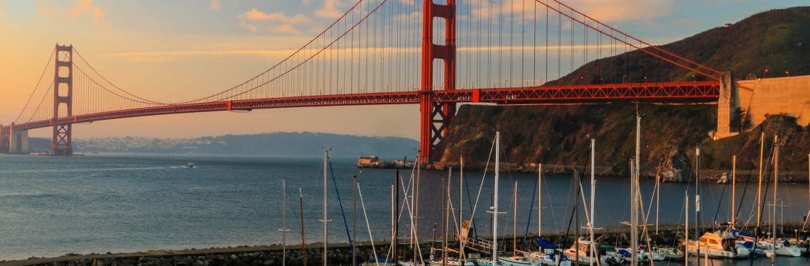
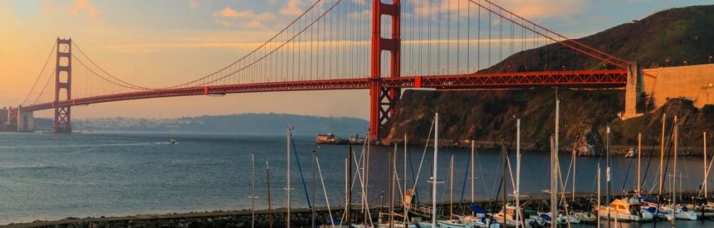
When the steel for the Golden Gate Bridge was fabricated by Bethlehem Steel at its foundries in PA and NJ, the steel was coated with a red lead primer. As the bridge towers began to rise for the Golden Gate Bridge, the architect Irving F. Morrow was driving home from work in the East Bay via ferry. He was inspired by the red lead color. Morrow did many color studies, which resulted in the specification of the unique Golden Gate Bridge International Orange because it blended well with the nearby hills and contrasted with the ocean and sky.
As the bridge stands today, the color blends perfectly with the changing seasons and colors and the San Francisco skyline. I love it when something is just right!
The color named “International Orange” existed before the bridge (and still exists) and is a color used in the aerospace industry to set things apart from their surroundings, similar to safety orange, but deeper and with a more reddish tone.
The Golden Gate Bridge is painted Golden Gate Bridge International Orange!!
The final color was the result of many studies by architects, sculptors, engineers, painters, and others. It takes a village!!
The Golden Gate Bridge International Orange color is mixed to very specific requirements. The bridge has maintained its formula for GGB International Orange through many years. But don’t worry… the requirements are not proprietary, and anyone can formulate and use the color!! In fact, the color formula is listed on the website and I pulled it for you to see:
Here is the scoop:
CMYK colors are: C= Cyan: 0%, M =Magenta: 69%, Y =Yellow: 100%, K = Black: 6%.
The closest existing color codes to GGB International Orange color are:
PMS 173 (CYMK = 0%, 80%, 94%, 1%),
PMS 174 (CYMK 8%, 85%, 100%, 34%)
Pantone 180 (CYMK 19.4%, 77.9%, 79.6%, 3.6%)
If you absolutely love this color, but have no way to get a PMS or Pantone match, you can purchase the closest off-the-shelf paint color, provided by Sherwin Williams. It is called “Fireweed” (color code SW 6328).
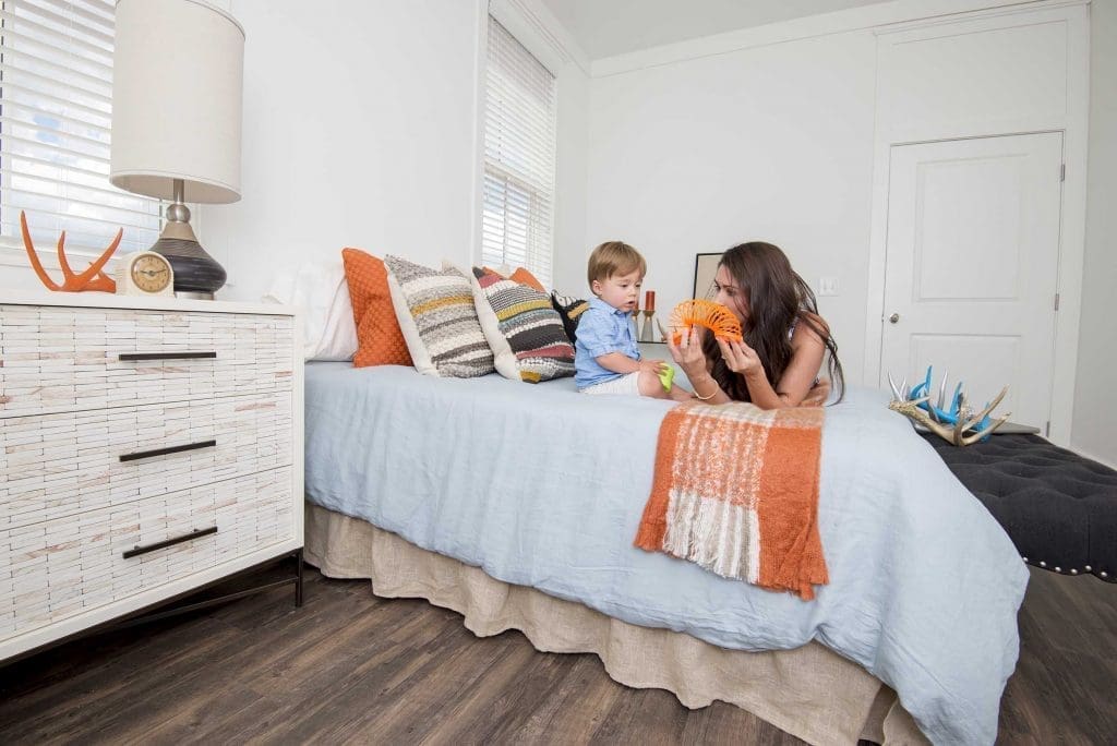
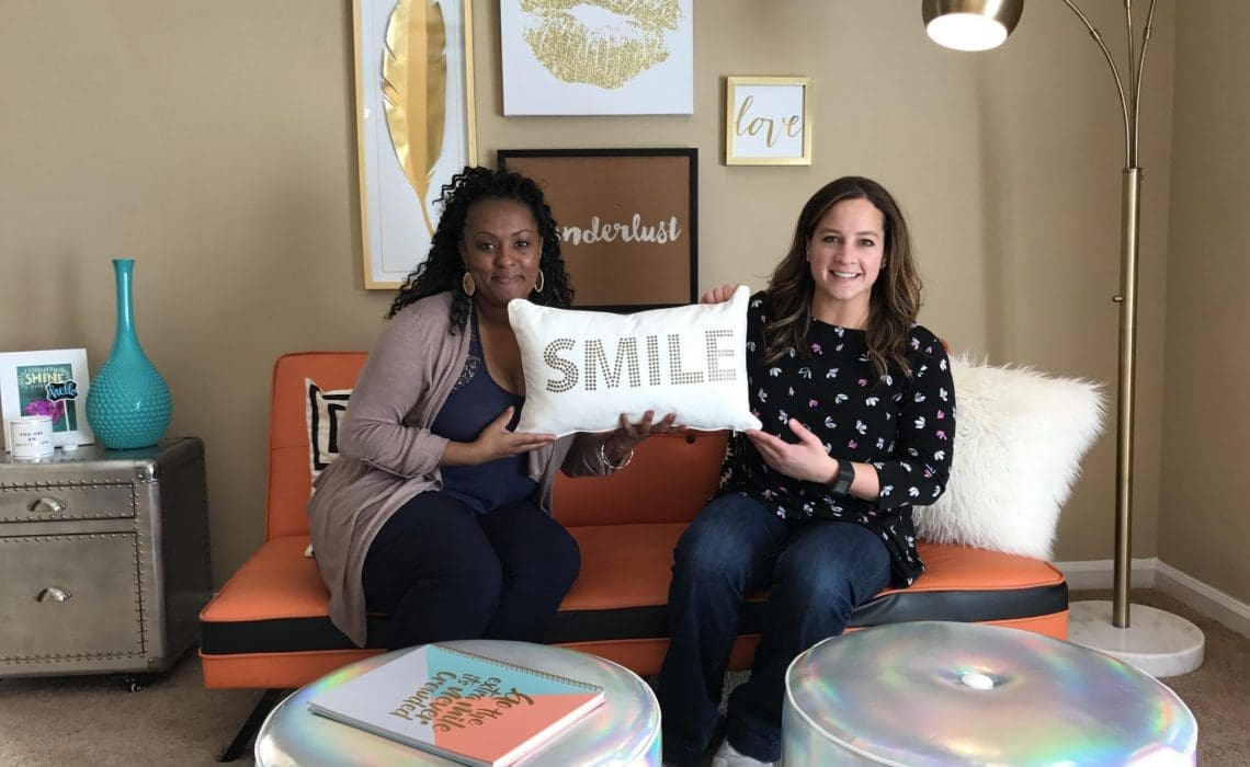
We had fun adding a pop of orange to a mini model in Old Town! Photo by: Suzanne Jones
Hire us today, and let us show you how to add a pop of color to make your space unique!!
Love,

Featured: #Pier1Imports #BethlehemSteel #SherwinWilliams #SW6328Fireweed #GoldenGateBridge #SanFrancisco #Fun #Paintcolors #Pantone #InternationalOrange


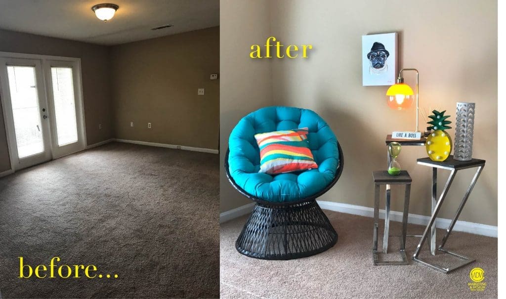
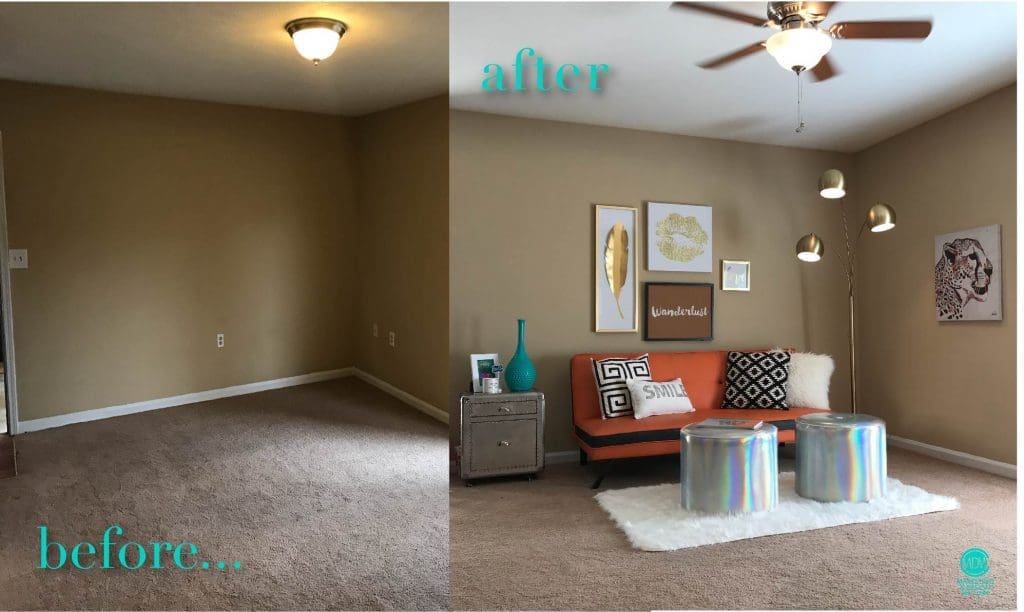
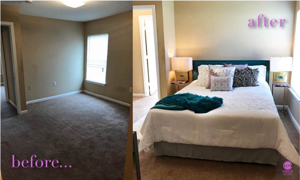
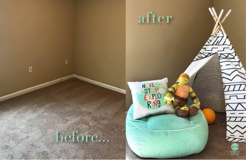
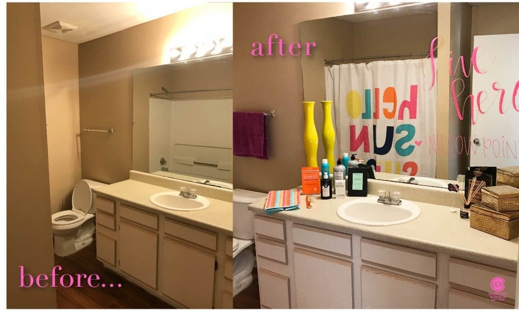
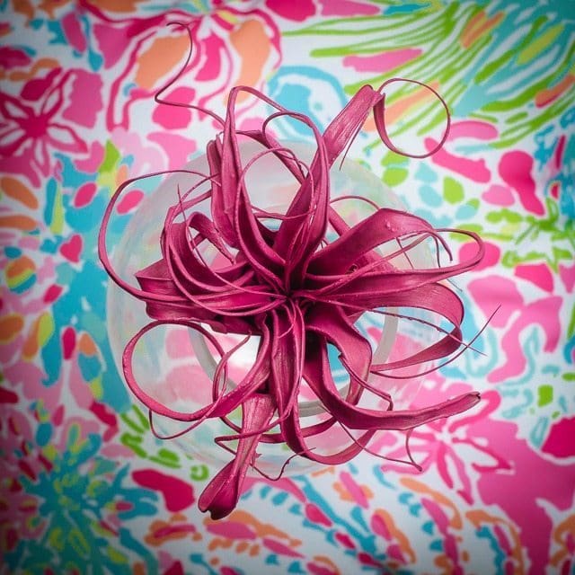
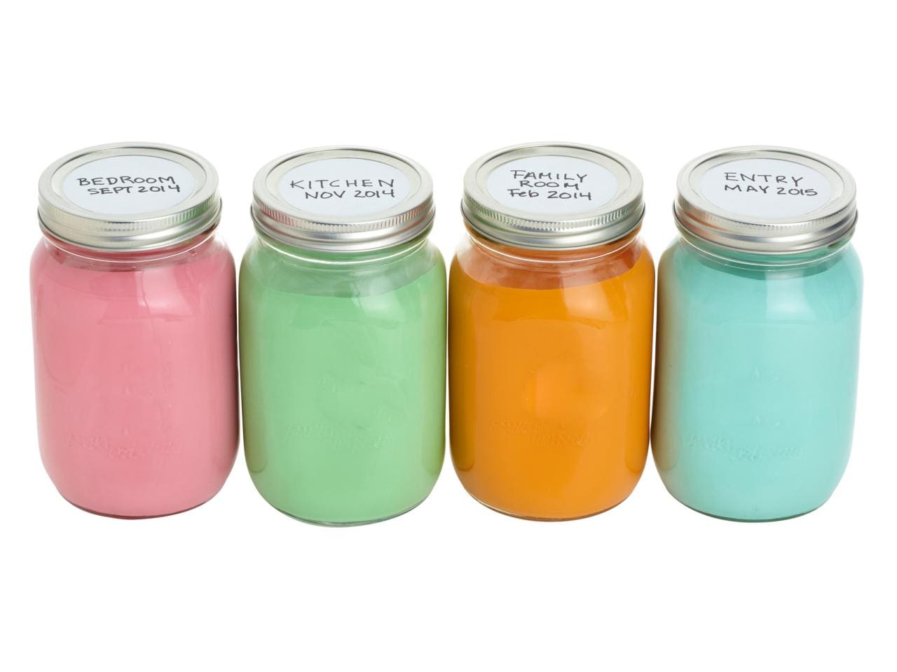 Not only is this a great idea, but the colors look super cute, especially if you have a palette you love!! If you are unsure of how to pick a palette to give your space a little “botox” hire us for a consultation or we can go the whole 9 yards!!